
Google Style
Guides & Frameworks
Foundational work impacting multiple teams and products
* The documents are confidential, below are illustrative examples


1
Security writing style guide

Problem
-
Security is complex, inconvenient, not fun, scary & confusing
-
UXR: Users are reluctant to learn, have misconceptions & don’t trust big tech
-
Google teams lacked a consistent strategy for bridging the gap to help users stay safe
-
Existing guidelines were few & not detailed
Process
-
Audited Google’s security UIs
-
Studied security writing in the industry
-
Reviewed user research to understand pain points & best practices
-
Aligned with leadership on strategy
-
Crafted guidance rooted in Google & industry standards
-
Presented to teams in a fun way to raise visibility & adoption
Impact
-
Expedited ramp-up for new security UXWs
-
Increased copy quality
-
Elevated the importance of content strategy in the org
-
Guidelines adopted by teams across Google
“Helen taught us how to speak about security. Since other companies copy from Google - she’s influenced the entire industry”
Lead PM

The guide included:
Data to support adoption
Research insights on user perceptions to encourage teams to follow the guidelines
Fundamentals
-
Translation of Google standards into security context, with examples
-
Style guidance
-
Tone & visuals for 3 security states: all’s well, neutral change, critical
-
Legal considerations
Specifics
-
Do’s / Don’ts
-
Patterns
-
Mechanics
-
Terminology
Example
Show the benefit to overcome hesitance
DO
Ways we can verify it’s you
These can be used to make sure it’s you signing in or reach you if we detect suspicious activity
Research shows users hesitate to give info to big tech, so we should highlight the benefit
DON’T
Sign-in methods
These can be used in addition
to your password
Research shows that users don’t take action if they don’t understand the implications
2
Google security notifications: UX/W guide

Problem
-
Scale:
Dozens of millions of notifications sent daily
100+ notification types
5 channels (push, email, recovery email, SMS, banner)
Complex flows -
Ambiguity:
No clarity on which cases should be designed as critical / non-critical -
Quality:
Existing copy was confusing, inconsistent -
Development velocity:
Adding new notifications took a long time as there were no UX/UXW resources
Process
-
Studied & categorized 100+ notifications
-
Gathered stakeholders to define critical / non-critical use cases
-
Translated Google & industry best practices into guidelines
-
Created a UX/UXW guide with a ready-to-use copy library
-
Co-created an internal website with all the resources clients need to set up a new notification
Impact
-
Unblocked new notifications
-
Expedited notification design from weeks to hours
-
Increased copy quality
-
Improved experience for teams
-
Guidelines added to Google Material, Google’s design system
“Helen's guidelines were recognized as "spectacular." They’re built to be scalable for Eng and helpful for users.”
UXW manager

Detailed guidance for all channels & flows:
Step-by-step guide
-
Think / Feel / Do writing template
-
Google voice guidelines with examples
-
Security voice guidelines with examples
-
Channel structure, what’s editable
-
Channel writing guidelines
-
Do’s & Don’ts with examples
-
Localization guidance
-
Checklists
Channel mapping
Partnered with a visual designer to create a map of all flow components, their interrelations & when each is triggered

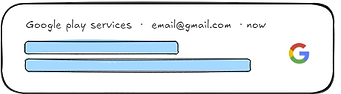
Example: Non-critical push notification
DO
Title
Use “Security alert”
Truncated after 29 chars
Body
Describe what happened in
the account
Truncated after 40 chars
-
Say what happened clearly so
users understand at a glance -
Use neutral, FYI language
-
Start with the strongest words
DON’T
-
Avoid alarming language
-
Avoid repetition & exclude automatically-added info
-
Avoid technical/possibly
unfamiliar terms like device names -
Be mindful of variables as they might get cut off


3
Google security states framework
Problem
-
Users’ account security state (all’s well, neutral change, critical) wasn’t conveyed clearly and consistently across UIs
-
Not all UIs can accommodate the same design & messaging
-
The team had no map of all the UIs & what’s communicated on each, making it difficult to form consistency
Process
-
Mapped all security states and sub types, what triggers them & what users need to know / do
-
Crafted content strategy & core messaging for each state
-
Studied & mapped all the relevant UIs
-
Explored & tested copy options
-
Crafted a ready-to-use copy library
Impact
-
Focused team’s attention on problem areas
-
Increased consistency across UIs
-
Expedited writing from
hours to minutes -
Increased copy quality
“Helen initiated the security state framework project, which helps reassure and drive users to action, create consistency,
and streamline writing”
Lead PM
This framework included:
User journey map
-
An illustration of account compromise stages, with green-yellow-red colors representing the user’s sentiment, needed tone & messaging
Copy library
-
Info on when each state is activated
-
Info on which UIs show it (10+)
-
Ready-to-use copy

Simplified example
State
activation
Main
message
What the user
needs to do
What the user
needs to do
UI1
UI2
UI3
UI4
-
Title
-
(2) Sub-state 2
-
Happens when…
-
Happens when…
-
Title
(1) Sub-state 1
-
Happens when…
-
Happens when…
-
Pattern 1
-
Pattern 2
-
Pattern 3
-
Pattern 4
(3) Sub-state 3
-
Happens when…
-
Happens when…
-
Title
-
Pattern 1
-
Pattern 2
-
Pattern 3
-
Pattern 4